FK Group is a global company that began its journey as an industry leader in business aviation. As the company grew its expertise in the fields of luxury yachts, and private & commercial real estate, StardustConcept was asked to reconsider its logo to better represent the firm’s expanded reach.
/ the brief
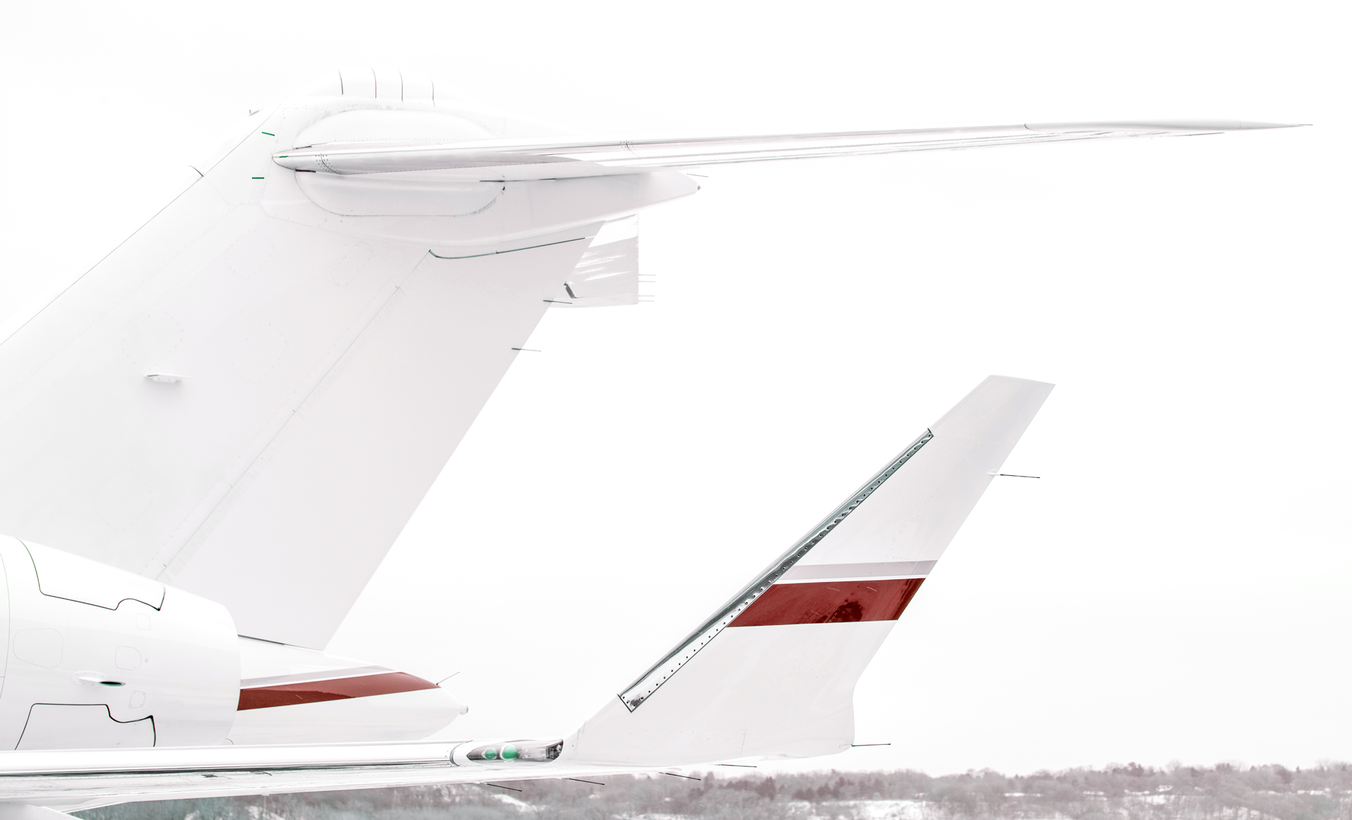
The original logo for FK Group was straightforwardly aligned to their core tenet - business aviation. This was represented in the logo by tightly integrating a swooshing jet into the wordmark made the business intent unmistakable. But as the company expanded its domain expertise, a new approach in the logo design was necessary to represent the conglomerate as well as prepare for any future expansion.
/ the concept
We are excited about opportunities to reimagine any element of a visual identity. We believe in continuity in design even when a complete overhaul is necessary.
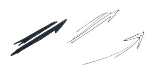
We considered the elements from the old logo that we could evolve to preserve the identity and found a good candidate in the swoosh. Not the exact shape or form of it but what it represented - Speed, Direction, Path.
We considered the elements from the old logo that we could evolve to preserve the identity and found a good candidate in the swoosh. Not the exact shape or form of it but what it represented - Speed, Direction, Path.
Further exploration led us to the swoosh as a circular path around the globe. It aligned with the global nature of FK Group and the ability of their product offerings in reaching anywhere across the earth.
Further exploration led us to the swoosh as a circular path around the globe. It aligned with the global nature of FK Group and the ability of their product offerings in reaching anywhere across the earth.
// the logo
We first started with icons for aviation, yachts and real estate
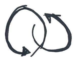
We interpreted the icons with the idea of the circular path to create our first draft. But. to us, this didn’t hit the mark. It felt visually crowded and conceptually both yachts and jets being on the same path didn’t seem to work.
We further investigated what it means to be able to travel across the globe. It meant one is exposed to new cultures and experiences. And often out of the this intersection, new perspectives emerge. We considered visual representations of this concept - multiple experiences colliding to create one greater than the sum of its parts.
// the final logo
// additional logos
We had the opportunity to create the logos for more sub-brands when FK Group expanded into cars and wine.