Menu Close

It was our deep privilege to create the full brand experience of the HerMeNow Accelerator, a program designed to highlight women-led social enterprises and give them the tools and resources to grow their businesses and achieve maximum impact in their communities.

HerMeNow Logo vertical version

/ the brief

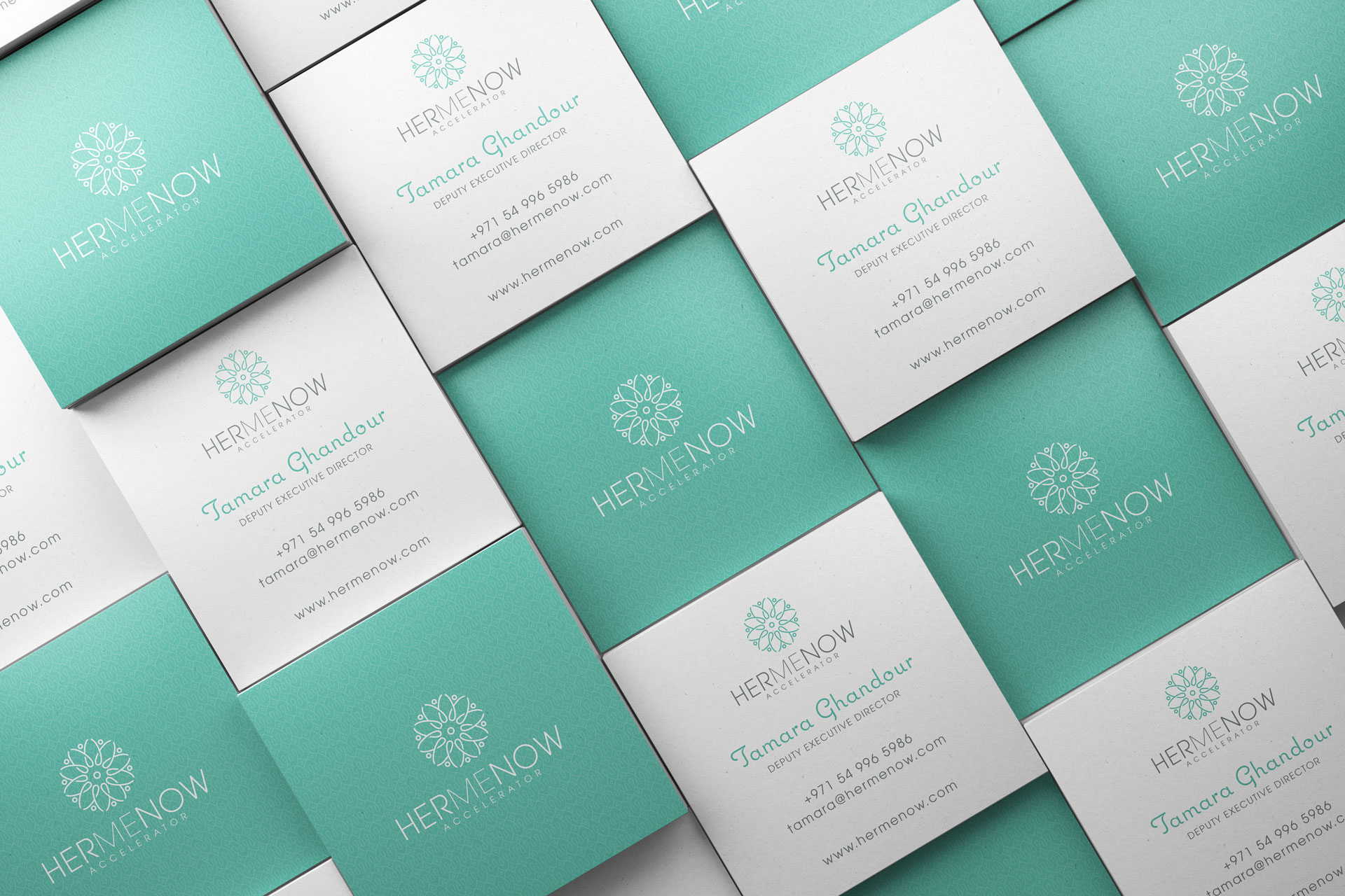
The global impact investment sector is a $1.16 trillion market. Yet, less than 1% is coming to MENA (Middle East and North Africa), the only region in the world where poverty rates have gone up since 2014. A part of the reason is the dearth of accelerators to support social enterprises. The HerMeNow Accelerator was created to address these issues. By specifically targeting women-led social enterprises, the team at HerMeNow hope to create a platform for broader socio-economic development in MENA. StardustConcept was asked to create the full brand identity - logo, color palette, typography, collaterals and the website.

/ the concept

At the outset, we were given carte blanche. We were informed that it is targeted for women entrepreneurs, with 10 finalists who would graduate from the program. We need to use the tagline which was already created - “Giving Women a Chance to Shine”. How were we to represent the serious nature of this endeavor while maintaining approachability for the lay-person? We set out to solve the logo first.

// the logo

We considered the brief from the client and boiled it down to a few sentences.

“HerMeNow Accelerator empowers women-led social enterprises with technical, financial and mentorship resources to transform the world. 30 Women-led social enterprises will benefit from a 2 week Sprint phase. 10 Women-led social enterprises will benefit from a 5 months accelerator program that supported them achieve their objectives and unlock impact for culture, education and mindset change toward gender and equality.”

There was a lot of brainstorming. And a lot of drawing.

floral variations of HerMeNow logo

And even more drawing...

Test variations of HerMeNow logo

We eventually settled on a few directions.

arrow pointed towards HerMeNow test logo made of a microphone
Hermenow Logo exporation with microphone

“Let Women Speak” was an early inspiration.
So why not visualize it with a mic?

A speech bubble that
doubled as the female symbol

Hermenow logo icon exploration with speech bubble
arrow pointed towards HerMeNow test logo made of a speech bubble
arrow pointed towards HerMeNow test logo made of a woman's silhouette

The speech bubble was also an abstract woman.

hermenow logo exporation with speech bubble and woman icon

An abstracted woman who’s silhouette morphed into a megaphone

hermenow logo exploration with a woman and a megaphone
arrow pointed towards HerMeNow test logo made of a woman and megaphone
Alternate flower shaped logo for HerMeNow

The idea fizzled out of steam just as we became excited about a new direction - A floral pattern to represent “blooming/flourishing”. We were inspired by jewelry designs to represent the subtlety of the feminine.

The floral patterns started to trend towards a complex shape that was built out of repeating a simpler shape.

Alternate flower shaped logo for HerMeNow
flower shaped test logo for HerMeNow

The idea felt connected to the impetus of the accelerator - to bring together women who would learn from each other, form bonds and raise each other up.

flower shaped test logo for HerMeNow

We began to actively pursue a floral pattern made of women figures.

test logo for HerMeNow

until finally....

HerMeNow icon explanation
HerMeNow icon

A flower made up of 10 women finalists raising each other up together.

HerMeNow icon

We used multiple fonts in the ITC Avant Garde family to create visual separation in the HerMeNow wordmark.

HerMeNow wordmark

We used multiple fonts in the ITC Avant Garde family to create visual separation in the HerMeNow wordmark.

HerMeNow wordmark

// final logo

HerMeNow Logo vertical version
black vertical line
HerMeNow logo horizontal
HerMeNow Logo vertical version
HerMeNow logo horizontal

// color palette

We did test pink as a shortcut to presenting the feminine; it was abandoned for being too cliched.

her me now exploratory logo options

We were encouraged by the team at HerMeNow to go deeper, while maintaining a more elegant approach. Unlike others in the non-profit sector, HerMeNow needn’t be a pushy, shouty voice. We pivoted toward pastel colors and quickly found the palette.

Primary

aquamarine color swatch

7FCCBE

light green color swatch

CDEAE4

grey color swatch

8C9492

Secondary

green color swatch

AFCB7F

blue color swatch

74CDDC

light blue color swatch

74A7DA

purple color swatch

BA78B3

// fonts

headers

Letters of the alphabet using the Last Signature font

subheader, body

Letters of the alphabet using the ITC Avant Garde font

quotes

Letters of the alphabet using the Coquette font

// collaterals

// website

HerMeNow icon
Silence And Light
First Project

Silence And Light

First