Menu Close

One Belvedere Tuscany is a luxurious country-style bed and breakfast, wellness center, and events venue being developed on a working farm in the heart of Tuscany and scheduled to open in 2024. StardustConcept is proud to have built out the complete brand experience for this prestigious project.

/ the brief

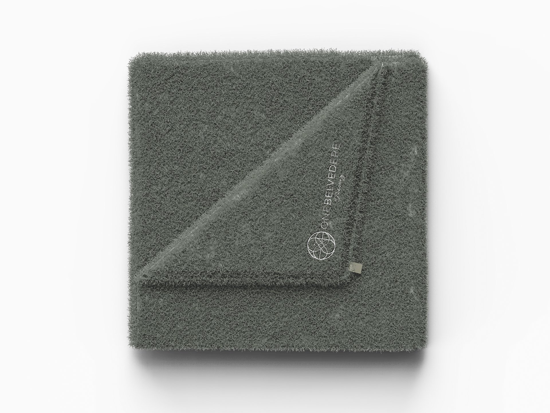
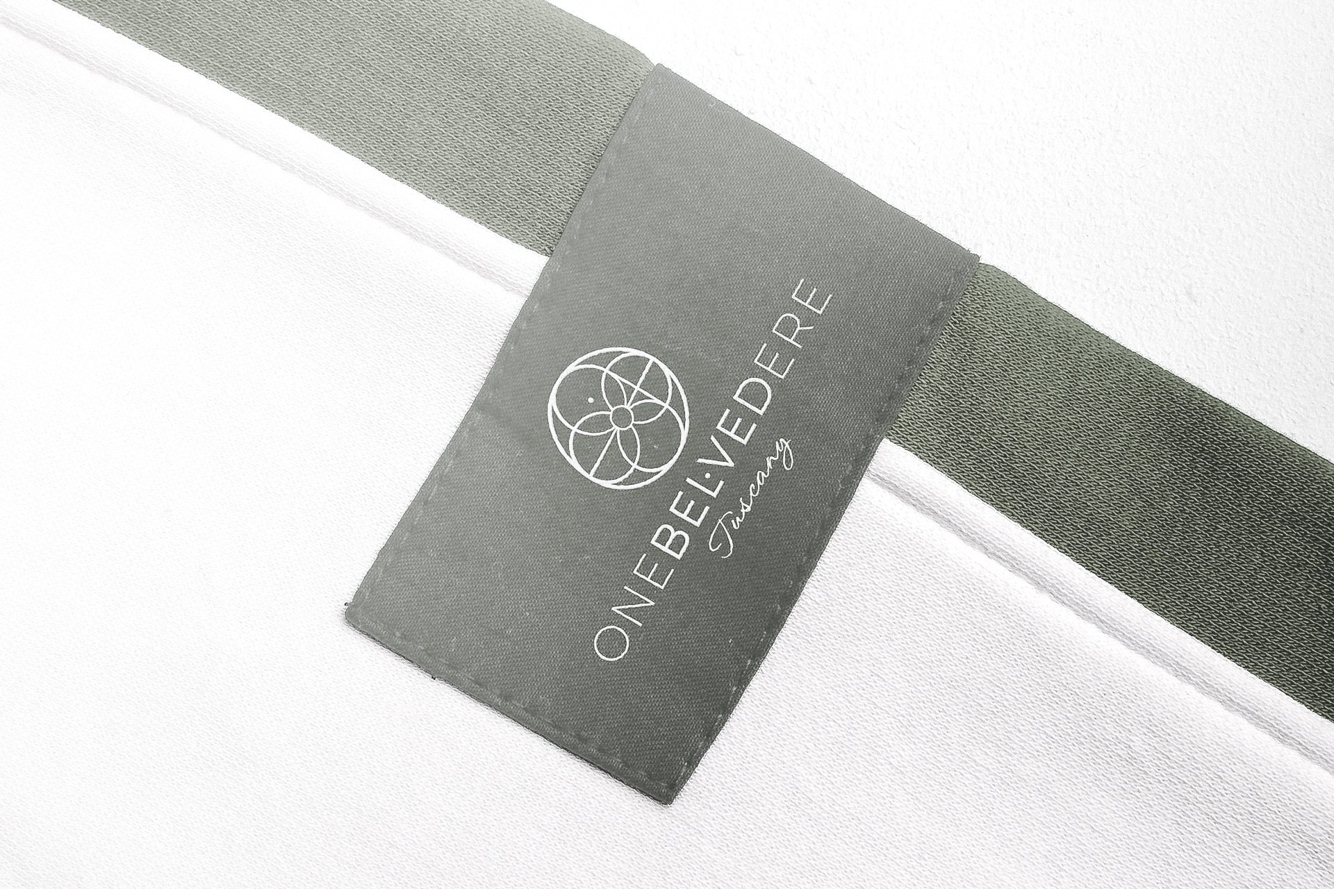
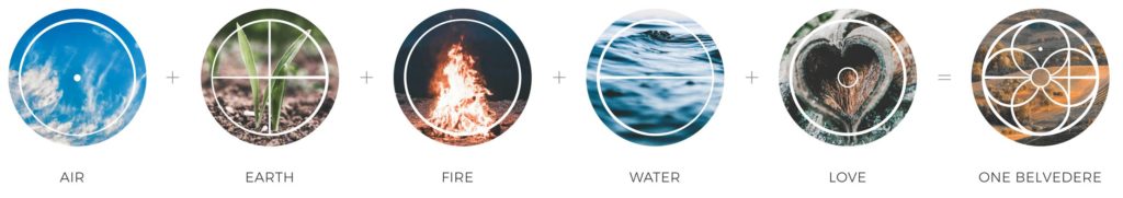
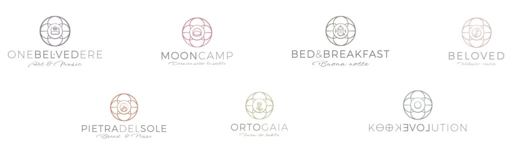
The One Belvedere project was born out of deep introspection and planning by its founding team. They wished to create an experience diametrically opposed to regular ventures in hospitality. Guided by their north star, the concept of “soul-align”, the team at One Belvedere have designed a space where visitors can rejuvenate their spirit and reconnect to nature. They asked us to craft an identity that matched their passion for this project - a deep love for nature, sustainability and Tuscany.

/ the concept

The One Belvedere team presented to us, in highly detailed form, the rollout strategy for the project. They linked each aspect of the activities to an element in nature using these well known alchemic symbols.

icons of air, earth, fire and water
One Belvedere icon

// the logo

We loved the research that was done as part of the presentation and decided to use these symbols of alchemy to build out the One Belvedere logo.

our recreation of the element icons

The purpose of One Belvedere is to find balance within the combination of the four elements. We decided the logo must be a visual representation of this concept. We tried different circular combinations to reinforce the cyclical form of the seasons in nature as well as the sustainability aspect of the project guided us to trying out circular combinations.

One Belvedere icon design exploration with options laid out in a grid

We liked the direction but it felt somehow....incomplete. What was it about One Belvedere that we found so charming? We revisited the presentations and recollected our encounters with the team. Their people were so lovely and giving. We were missing their presence in the logo.

love icon

So we introduced a new element and called it Love.
One Belvedere is nature’s elements in balance because they are caught in the embrace of love.

Explainer of all elements that add up to the One Belvedere logo

// the final logo

One Belvedere icon
Circular version of One Belvedere logo

Inspired by the beautiful Tuscan night sky, and our tagline that defined the expanse of space within the human body and mind, we constructed a geometric star; a living object radiating energy. Though from a seemingly tiny source, its light is ever expanding and illuminating.

// additional logos

The logos for various properties within the project were custom made from the core logo.

logos of One Belvedere sub-brands

// fonts

The idea of love was present as we explored the wordmark. We settled on the Montserrat family for the font.

One Belvedere wordmark

Using thin and light version of the family, we carved out the word “BELOVED” in the middle of the wordmark. The addition of the metaphorical O with a dot? Well, let’s leave that to artistic flight of fancy!

// color palette

Inspired by the colors of the Tuscany, the olives, earth and flora, we built the palette that best captured the feeling of visiting One Belvedere.

One Belvedere color swatches

// collaterals

// website

One Belvedere icon
Spatio
Next Project

Spatio

Next