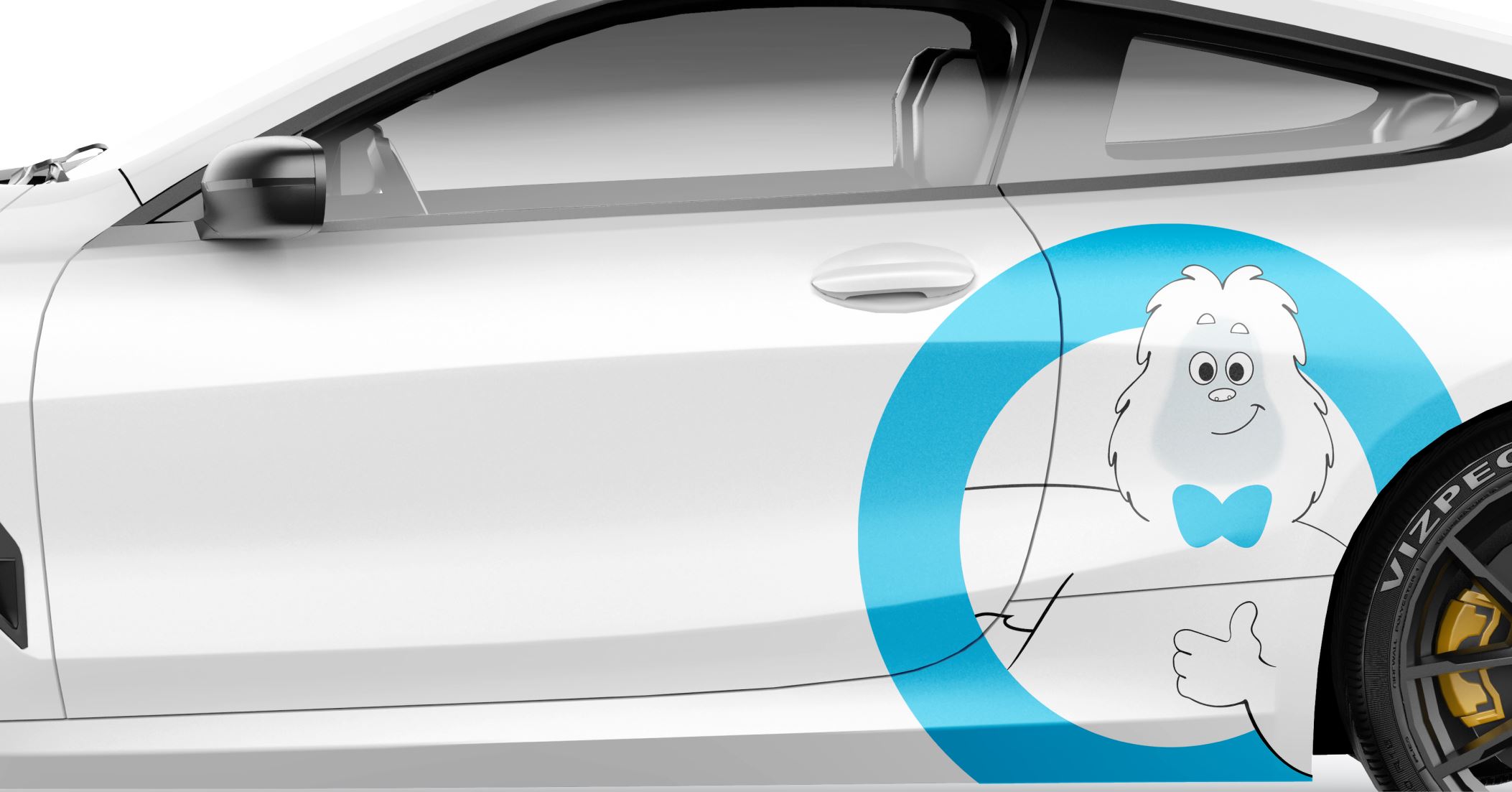
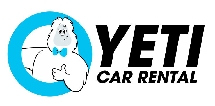
Yeti Car Rental is a leading car rental and leasing service in Dubai. We evolved the visual identity of their mascot, Mr. Yeti to be a fully realized three-dimensional character.
/ the brief
Founded in 2014, Yeti Car Rental is built around the values of professionalism, quality service, and value. They built their visual identity around their mascot, the mythical Yeti aka the abominable snowman. In nearly the decade since the company’s inception, the mascot has not seen much use beyond the logo. StardustConcept was tasked with evolving the visual look of the mascot and giving him character and personality.
/ the concept
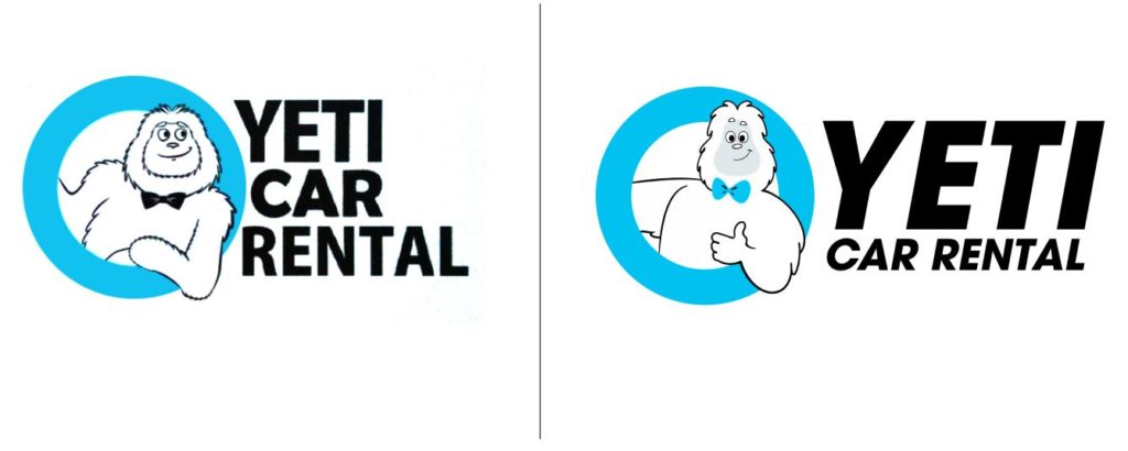
We believed the founders of Yeti Car Rental got a lot right in the first version of the logo. The name is memorable, short and refreshingly, not a boring literal derivative of the car rental services industry. Mr. Yeti is friendly and approachable. We found the original design whimsical and a great starting point to further refine the design and expand the character’s presence in the company’s visual presence.
Our goals were -
Clarity at First Glance
Build loyalty by creating a character that is memorable and endearing
Consistency in branding across different touchpoints
// the research - Client Interview
We shortlisted a set of keywords from an interview with the client on what they believed best represented the personality of Mr. Yeti. From these keywords, we found our guiding principles to adhere to while designing the mascot.
// the research
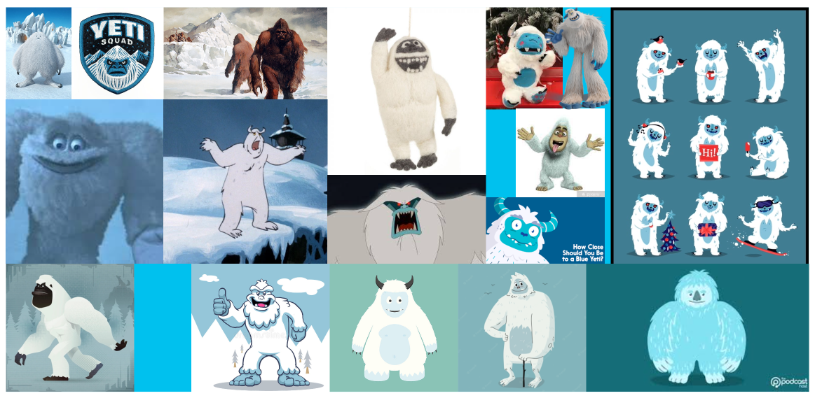
Our moodboard research explored pop culture representations of the yeti.
We also were drawn to how sports and corporate mascots were illustrated, particularly their use of varied linework, conveying varying levels of emotion, balance in positive and negative space etc.
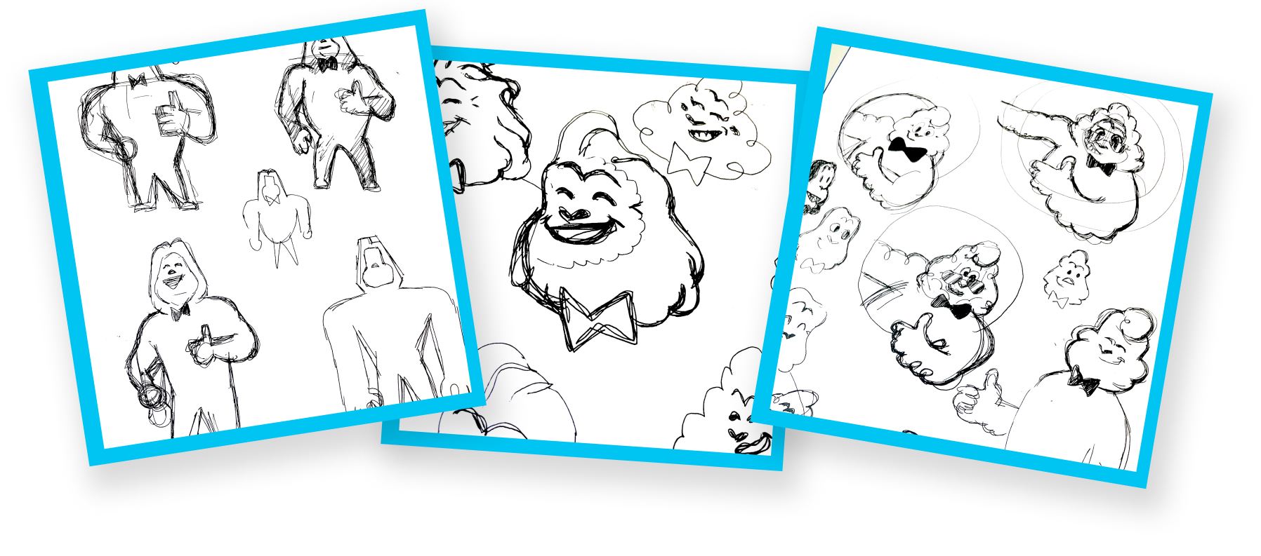
// the process sketches
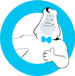
We first set about exploring the shapes in loose lines. Very early on, the results started to narrow into a smiling, friendly version of the Yeti with a professional bowtie. The character giving a thumbs up is a more active pose compared to the folded arm and tucked inward hand of the original.
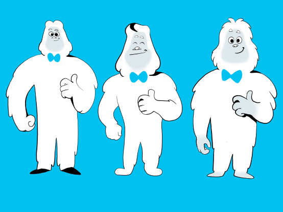
// drafts
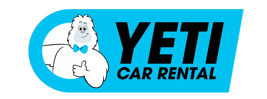
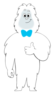
We simplified the linework, gave Mr. Yeti a more active pose by him giving a thumbs up. We also brought in more dynamism to the silhouette (note the straight lines in his right arm contrasting with the curves in his bent left arm). And finally, we found the original bowtie distracting from the face. The bowtie is now simplified and turned blue
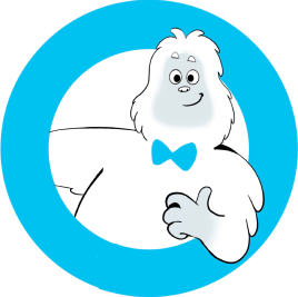
// final design
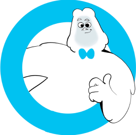
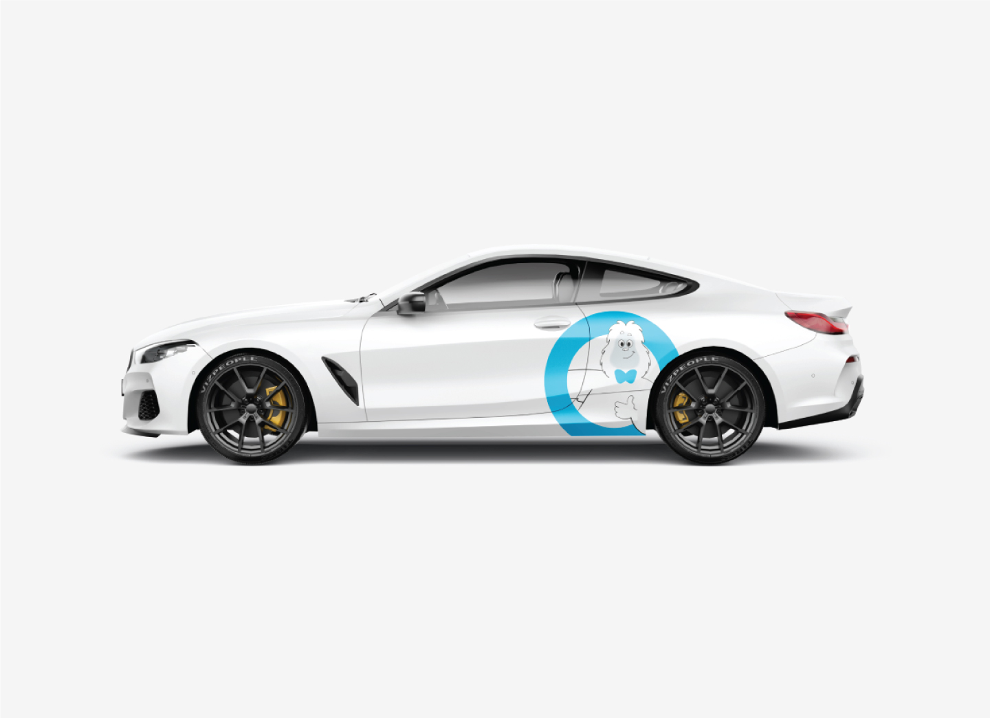
After review from the client, the final design has updated the linework and silhouette for maximum readability.
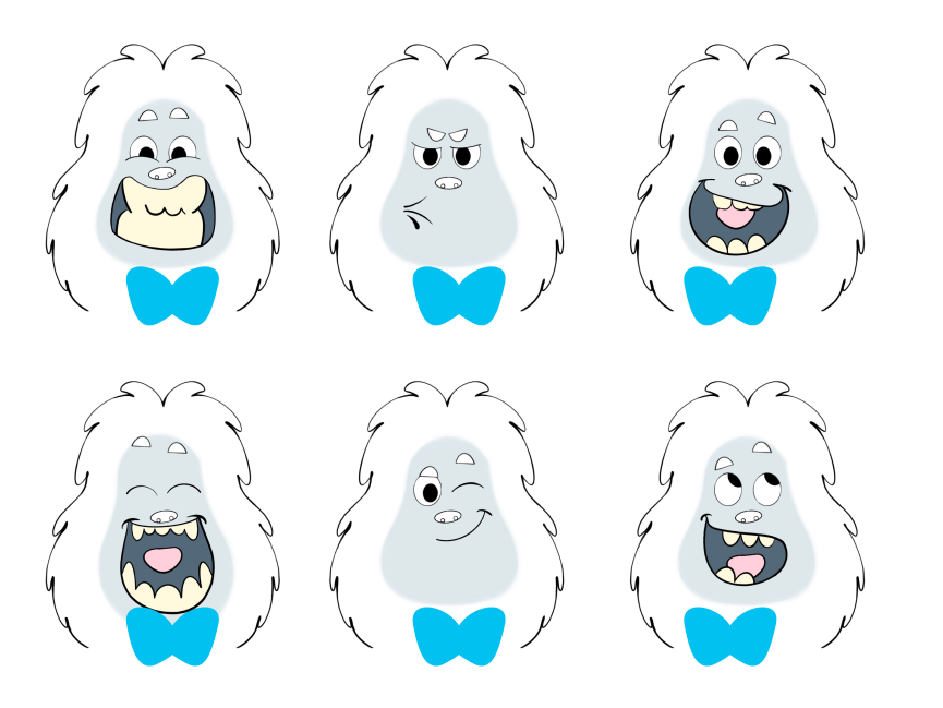
// character design
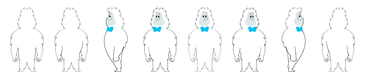
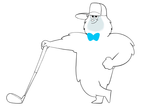
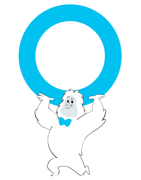
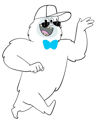
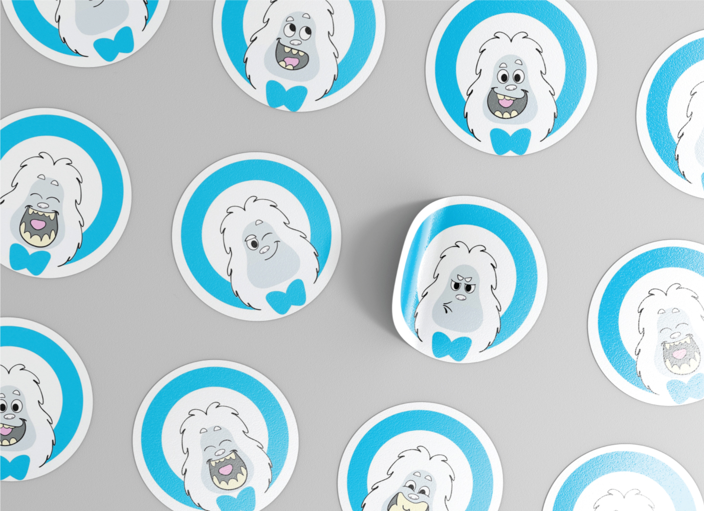
The real opportunity with this character lies in marketing, so we committed to designing a full turnaround of Mr. Yeti and explored his personality in facial features and expression poses.